Label Axes in Excel is crucial for creating insightful charts. Without clear labels, your visualizations can be confusing and misleading. This guide dives deep into the art of effectively labeling both X and Y axes, ensuring your Excel charts communicate data accurately and compellingly. From understanding fundamental axis concepts to mastering different chart types, we’ll explore the best practices for creating professional-looking charts that tell a story.
We’ll cover everything from basic labeling techniques to advanced customizations, like adjusting font sizes and using logarithmic scales. Learn how to craft concise and informative labels that clearly convey the data represented in your charts. Whether you’re creating bar charts, line graphs, or scatter plots, this guide provides the tools and insights to transform your Excel charts into powerful communication tools.
Introduction to Excel Axes
Excel charts are powerful tools for visualizing data. At the heart of these visualizations are the axes, which provide a framework for understanding the relationships between different variables. Properly labeled axes are crucial for accurate interpretation and effective communication of insights.Axes in Excel spreadsheets define the coordinate system for plotting data points. They establish the scale and units along which data values are represented.
Label axes, specifically, provide context by indicating the meaning of the values on each axis. This context is essential for anyone interpreting the chart’s information.
Fundamental Concept of Axes
Axes are the foundation of any chart. They establish the scale and units used to represent data. The horizontal axis (x-axis) typically represents the independent variable, while the vertical axis (y-axis) represents the dependent variable. Understanding this fundamental relationship is crucial for drawing meaningful conclusions from the chart.
Definition of Label Axes
Label axes means adding descriptive labels to the x-axis and y-axis to clearly indicate what the values represent. These labels are not just arbitrary names; they are critical for conveying the meaning of the data plotted on the chart. For example, an x-axis labeled “Time (hours)” instantly tells the viewer the units of the data along that axis.
Importance of Labeling Axes in Excel Charts
Clear axis labeling is vital for effective chart interpretation. Without proper labels, viewers might struggle to understand the data being presented. A chart with ambiguous labels can lead to misinterpretations, and even potentially erroneous conclusions. This highlights the importance of choosing descriptive and unambiguous labels for each axis.
How Incorrect Axis Labeling Affects Chart Interpretation
Incorrect or missing axis labels can significantly impact the comprehension of a chart. Consider a chart showing sales figures over time without specifying the time period. The viewer might not understand if the data represents sales over a week, a month, or a year. This lack of clarity can lead to misinterpretations and incorrect conclusions about the trends.
Example of an Excel Chart with Labeled Axes
Imagine a chart displaying the growth of a company’s revenue over a five-year period. The x-axis is labeled “Year (2018-2022)” and the y-axis is labeled “Revenue (USD in Millions)”. This clear labeling allows the viewer to immediately understand the context of the data. The chart’s title could further clarify the specific company or industry. A well-labeled chart, in this example, immediately conveys the company’s revenue growth from 2018 to 2022.
Figuring out how to label axes in Excel can be a real head-scratcher, but it’s a crucial skill for clear data visualization. While I was wrestling with Excel’s labeling functions, I decided to take a break and listen to some new music, like the latest track by Isaiah Rashad, SZA, and 6lack. This song really got me in the zone, and now I’m ready to tackle those Excel axes again.
Once you get the hang of labeling your axes, your charts will be so much more informative!
Different Chart Types and Axes
Excel’s charting capabilities extend far beyond simple bar graphs. Understanding the various chart types and their associated axes is crucial for effectively communicating data insights. Different chart types excel at showcasing different relationships and trends, and the axes play a vital role in accurately representing these data points. Choosing the appropriate chart type is critical for conveying the intended message.Different chart types employ axes in diverse ways, emphasizing specific aspects of the data.
The structure of these axes, and the way data is mapped onto them, significantly impacts how the chart conveys information. Understanding these nuances allows for the creation of charts that are both informative and easy to interpret.
Chart Types and Axis Structure
Various chart types in Excel leverage axes differently to highlight distinct data relationships. This section details how different chart types employ axes.
- Bar Charts: Bar charts use categorical data on the horizontal axis (x-axis) and numerical data on the vertical axis (y-axis). The height of each bar directly corresponds to the value on the y-axis, making it easy to compare quantities across different categories. The x-axis labels often represent different categories or groups, while the y-axis represents the magnitude of the values.
Axis labels are critical for clarity and understanding the comparisons being made.
- Line Charts: Line charts are effective for visualizing trends over time or continuous variables. The x-axis usually represents the independent variable (e.g., time), and the y-axis represents the dependent variable (e.g., sales). The lines connect data points, illustrating the changes in the dependent variable as the independent variable progresses. Clear axis labels are essential for interpreting the trend accurately.
- Scatter Plots: Scatter plots depict the relationship between two numerical variables. Both the x-axis and y-axis represent numerical values. Each data point is plotted as a marker, and the pattern of the points reveals the correlation or lack thereof between the two variables. Precise axis scaling is crucial for accurately representing the relationship.
Impact of Chart Type on Axis Labeling
The choice of chart type influences the required detail and complexity of axis labeling. Clear and concise labels are paramount for accurate data interpretation.
- Bar Charts: Bar chart labels should clearly identify the categories being compared. For example, instead of simply “Sales,” labels might specify “Sales by Region” or “Sales by Product Type.” The y-axis label should precisely describe the measured quantity, like “Sales in Dollars.”
- Line Charts: Line chart labels need to clearly define the independent and dependent variables. For example, if the x-axis represents time, the label might be “Time in Months,” and the y-axis label could be “Sales Revenue.” Consistent units are essential for accuracy.
- Scatter Plots: Scatter plot axis labels should precisely identify the variables being plotted. For example, labels like “Customer Age” and “Purchase Amount” ensure accurate interpretation of the relationship between the variables.
Different Axis Scales
Different chart types may require different axis scales to effectively represent the data.
- Bar Charts: Scales should be appropriate for the range of values in the data, ensuring all bars are clearly visible and easily compared. Choosing a scale that allows for clear visualization of differences between bars is crucial.
- Line Charts: Scales should accommodate the range of values and ensure that trends are clearly visible. Scales should be chosen to showcase the overall trends and not distort the data.
- Scatter Plots: The scale should allow for the precise plotting of data points and the identification of any correlations or patterns. A logarithmic scale may be necessary if the data has a very wide range of values.
Chart Type and Axis Considerations Table
| Chart Type | X-Axis | Y-Axis | Labeling Considerations |
|---|---|---|---|
| Bar Chart | Categorical Data | Numerical Data | Clear category labels, precise unit descriptions |
| Line Chart | Continuous Data (e.g., Time) | Numerical Data | Independent and dependent variable labels, consistent units |
| Scatter Plot | Numerical Data | Numerical Data | Precise variable labels, appropriate scale for data range |
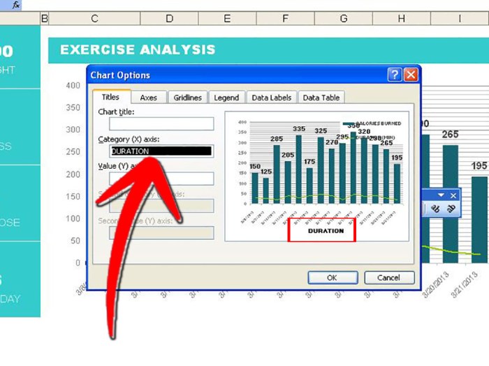
Labeling the X-axis
 - wikiHow")
Effective X-axis labels are crucial for clear and accurate chart interpretation. They provide context and meaning to the data plotted on the horizontal axis, allowing viewers to understand the independent variable and its relationship to the dependent variable. A well-crafted X-axis label can significantly enhance the overall understanding and impact of your chart.Properly labeled X-axes transform raw data into meaningful insights.
They connect the visual representation to the underlying information, facilitating easier comprehension and informed decision-making. This section dives into best practices for crafting informative and effective X-axis labels in Excel charts.
Effective X-axis Label Examples
Different types of data require different label styles. A label for sales figures over time should differ from one depicting product categories. Examples of effective labels include “Time (Years)”, “Product Category”, “Temperature (°C)”, or “Sales (USD)”. Notice how these labels clearly communicate the data’s nature and units.
Figuring out how to label axes in Excel can be tricky, but it’s essential for clear visualizations. While you’re wrestling with those axis labels, why not take a break and listen to Nicki Minaj and Ariana Grande’s new song, “Bed” listen to nicki minaj and ariana grandes new song bed ? Once you’ve got your groove on, come back to Excel and ensure your charts are easily understandable with properly labeled axes.
It’s all about making data shine!
Creating Concise and Informative Labels
To create concise and informative labels, avoid unnecessary jargon or overly technical terms. Use clear and straightforward language that the intended audience can easily grasp. For example, instead of “Quarterly Revenue Growth Rate,” opt for “Sales Growth (Qtr.)”. Keep the label brief and focused on conveying the essential information. Conciseness enhances readability and reduces clutter.
Formatting X-axis Labels
Font size and alignment are critical formatting elements. A font size that is too small makes the label difficult to read, while a size that is too large can overcrowd the chart. Font size should be proportionate to the overall chart size and text. Center alignment is often the most effective choice for labels, ensuring they are clearly visible and easily readable.
Importance of Units in X-axis Labels
Always include appropriate units in your X-axis labels. This ensures clarity and accuracy. For example, if the data represents time in months, the label should read “Time (Months)”. If the data represents temperature, the label should specify the unit of measurement, such as “Temperature (°C)”. Omitting units can lead to misinterpretations and inaccuracies in data analysis.
Table of X-axis Label Formats
| Label Format | Effectiveness | Explanation |
|---|---|---|
| Sales (2022-2024) | Good | Clearly indicates the time period for sales data. |
| Time (Years) | Excellent | Provides a generic but informative description. |
| Product Type (Q1 2023) | Fair | Needs additional context; consider specifying the year. |
| Revenue (Qtrly) | Poor | Lacking clarity on units (currency). |
| Temperature (Celsius) | Excellent | Specifies the measurement unit for temperature. |
This table demonstrates the importance of including units and clear time periods. A clear label helps avoid misunderstandings and promotes effective data interpretation.
Labeling the Y-axis: Label Axes In Excel
Effective labeling of the Y-axis is crucial for clear and accurate data representation in Excel charts. A well-defined Y-axis allows the audience to quickly grasp the magnitude and trends of the data being presented. This is vital for conveying information effectively and avoiding misinterpretations. Properly labeled axes empower viewers to draw meaningful conclusions from the data.Precise and unambiguous labeling of the Y-axis is paramount to ensure the data presented is accurately interpreted.
This involves selecting appropriate units, ranges, and formats to ensure that the relationship between the values on the Y-axis and the corresponding data points is readily understood. A poorly labeled Y-axis can lead to misinterpretations and a failure to grasp the true story behind the data.
Strategies for Effective Y-Axis Labeling
Careful consideration of the Y-axis scale is vital for accurate data representation. The choice of scale greatly impacts how the data is perceived. A linear scale is suitable for data that shows a consistent rate of change, while a logarithmic scale is beneficial for data with large variations or exponential growth.
Specifying Units for the Y-Axis, Label Axes in Excel
Explicitly stating the units associated with the Y-axis values is essential for proper data interpretation. This avoids ambiguity and ensures that viewers understand the context of the data. For example, if the Y-axis represents sales figures, including the unit “dollars” (e.g., “Sales (USD)”) clarifies the meaning of the values. Without units, the values become abstract and meaningless.
Figuring out how to label axes in Excel can be a real pain sometimes, but it’s a crucial step for clear visualizations. It’s like setting up a clean slate, especially when you’re dealing with a lot of data. This is analogous to wiping a Mac clean, Wipe a Mac Clean , which is useful when you need a fresh start for your computer.
Ultimately, properly labeling your Excel axes makes your charts much easier to understand and interpret.
Examples of Effective Y-Axis Labels
Here are some examples of effective Y-axis labels:
- Population (Thousands): This label clearly indicates that the Y-axis values represent population figures, and the use of “thousands” provides context for the scale.
- Profit Margin (%): This label specifies that the Y-axis values represent profit margins expressed as percentages, which is essential for accurate interpretation.
- Temperature (°C): This label specifies the unit of measurement for the Y-axis, temperature in degrees Celsius, making the data instantly understandable.
Avoiding Ambiguity in Y-Axis Labels
Ambiguity in Y-axis labels can lead to misinterpretations. For example, a label simply reading “Sales” is insufficient without specifying the units (e.g., “Sales (USD)”) or the time period covered. A clear and concise label, using appropriate units and providing context, is crucial for accurate interpretation. The label should directly correspond to the data being plotted.
Formatting Y-Axis Labels, Including Logarithmic Scales
The formatting of Y-axis labels significantly impacts readability and clarity. Use clear and easily readable fonts, and ensure the labels are not overlapping with other chart elements. Consider using logarithmic scales when dealing with data exhibiting significant variations in magnitude. A logarithmic scale compresses the large values, allowing for a more comprehensive visualization of trends across a wide range of data.
- Linear Scale: This is suitable for data where values change consistently. The scale increases in equal increments along the Y-axis.
- Logarithmic Scale: This scale is particularly useful when dealing with data that spans several orders of magnitude. It compresses large values, allowing for a more comprehensive visualization of trends across a wider range of data. A logarithmic scale is useful for data that exhibits exponential growth or decay.
Customizing Axis Labels
Taking your Excel charts from basic to beautiful involves customizing axis labels. This crucial step allows you to enhance readability, convey specific information, and tailor the chart to your exact needs. Clear and well-formatted labels are essential for effective communication through charts.Modifying axis labels in Excel is a straightforward process, allowing you to control various aspects of their appearance, from the font and color to their alignment and format.
This flexibility empowers you to create visually appealing and informative charts.
Modifying Axis Label Text
To change the text displayed on your axis labels, select the axis you want to modify. Then, right-click on the axis label. This will open a context menu offering options to modify the label text. Alternatively, you can click on the label itself, and the formatting options should be available in the ribbon. This allows for direct editing of the label’s content, whether it’s a simple change or a complete rewrite.
Customizing Font, Color, and Size
Once you’ve selected the axis label, look for the “Font” options in the formatting section of the ribbon. Here, you can change the font style, size, and color. Select the desired font, adjust the font size to an appropriate level for readability, and choose a color that complements the chart’s theme. Using bold fonts can highlight critical data points or axis labels.
Darker colors on a light background, or vice versa, generally ensure better visibility.
Rotating and Aligning Axis Labels
Excel allows for rotation and alignment of axis labels for optimal readability. You can rotate labels to prevent overlapping and enhance clarity. Adjusting the label alignment, such as left, center, or right, ensures labels are aligned with the data they represent, enhancing the overall aesthetics and clarity of the chart. This adjustment is particularly helpful when dealing with labels that contain longer text strings.
Using Custom Number Formats
Custom number formats allow for more sophisticated presentation of axis labels, especially when dealing with numerical data. For example, you can format labels to display currency, percentages, or dates in a specific style. This feature ensures data is presented in a way that’s both informative and visually appealing.For example, you can use a custom format to display percentages with a “%” symbol appended, or to show dates in a specific order (e.g., MM/DD/YYYY).
This formatting will automatically adjust the labels based on the corresponding data.
Example: Formatting Axis Labels for Readability
Let’s say you have a chart showing sales figures over time. You could use a custom number format to display the sales figures as currency (e.g., “$1,234”). You could also use a bold, dark blue font for the labels, ensuring high visibility against a light-colored background. This combination will make the chart easily readable and instantly convey the financial information.
Rotating the labels by a few degrees can also be useful in avoiding overlaps.
Ending Remarks

In conclusion, mastering axis labeling in Excel is a vital skill for anyone working with data visualization. By understanding the importance of clear and informative labels, you can transform your charts from static displays into dynamic communication tools. This guide has provided a comprehensive overview of the different aspects of labeling axes, from basic concepts to advanced customization techniques.
Remember, clear labels are key to effective data communication. By applying the techniques discussed here, you can significantly enhance the clarity and impact of your Excel charts.